#How to create navigation bar in html
Explore tagged Tumblr posts
Visit Tumblr Blog
Explore Tumblr blogs with no restrictions, modern design and the best experience.
Last Seen Tumblr Blogs


Fun Fact
12.7% of mobile users access Tumblr.
Text
How to Create Multi-Step Forms With Vanilla JavaScript and CSS
New Post has been published on https://thedigitalinsider.com/how-to-create-multi-step-forms-with-vanilla-javascript-and-css/
How to Create Multi-Step Forms With Vanilla JavaScript and CSS
Multi-step forms are a good choice when your form is large and has many controls. No one wants to scroll through a super-long form on a mobile device. By grouping controls on a screen-by-screen basis, we can improve the experience of filling out long, complex forms.
But when was the last time you developed a multi-step form? Does that even sound fun to you? There’s so much to think about and so many moving pieces that need to be managed that I wouldn’t blame you for resorting to a form library or even some type of form widget that handles it all for you.
But doing it by hand can be a good exercise and a great way to polish the basics. I’ll show you how I built my first multi-step form, and I hope you’ll not only see how approachable it can be but maybe even spot areas to make my work even better.
We’ll walk through the structure together. We’ll build a job application, which I think many of us can relate to these recent days. I’ll scaffold the baseline HTML, CSS, and JavaScript first, and then we’ll look at considerations for accessibility and validation.
I’ve created a GitHub repo for the final code if you want to refer to it along the way.
The structure of a multi-step form
Our job application form has four sections, the last of which is a summary view, where we show the user all their answers before they submit them. To achieve this, we divide the HTML into four sections, each identified with an ID, and add navigation at the bottom of the page. I’ll give you that baseline HTML in the next section.
Navigating the user to move through sections means we’ll also include a visual indicator for what step they are at and how many steps are left. This indicator can be a simple dynamic text that updates according to the active step or a fancier progress bar type of indicator. We’ll do the former to keep things simple and focused on the multi-step nature of the form.,
The structure and basic styles
We’ll focus more on the logic, but I will provide the code snippets and a link to the complete code at the end.
Let’s start by creating a folder to hold our pages. Then, create an index.html file and paste the following into it:
Open HTML
<form id="myForm"> <section class="group-one" id="one"> <div class="form-group"> <div class="form-control"> <label for="name">Name <span style="color: red;">*</span></label> <input type="text" id="name" name="name" placeholder="Enter your name"> </div> <div class="form-control"> <label for="idNum">ID number <span style="color: red;">*</span></label> <input type="number" id="idNum" name="idNum" placeholder="Enter your ID number"> </div> </div> <div class="form-group"> <div class="form-control"> <label for="email">Email <span style="color: red;">*</span></label> <input type="email" id="email" name="email" placeholder="Enter your email"> </div> <div class="form-control"> <label for="birthdate">Date of Birth <span style="color: red;">*</span></label> <input type="date" id="birthdate" name="birthdate" max="2006-10-01" min="1924-01-01"> </div> </div> </section> <section class="group-two" id="two"> <div class="form-control"> <label for="document">Upload CV <span style="color: red;">*</span></label> <input type="file" name="document" id="document"> </div> <div class="form-control"> <label for="department">Department <span style="color: red;">*</span></label> <select id="department" name="department"> <option value="">Select a department</option> <option value="hr">Human Resources</option> <option value="it">Information Technology</option> <option value="finance">Finance</option> </select> </div> </section> <section class="group-three" id="three"> <div class="form-control"> <label for="skills">Skills (Optional)</label> <textarea id="skills" name="skills" rows="4" placeholder="Enter your skills"></textarea> </div> <div class="form-control"> <input type="checkbox" name="terms" id="terms"> <label for="terms">I agree to the terms and conditions <span style="color: red;">*</span></label> </div> <button id="btn" type="submit">Confirm and Submit</button> </section> <div class="arrows"> <button type="button" id="navLeft">Previous</button> <span id="stepInfo"></span> <button type="button" id="navRight">Next</button> </div> </form> <script src="script.js"></script>
Looking at the code, you can see three sections and the navigation group. The sections contain form inputs and no native form validation. This is to give us better control of displaying the error messages because native form validation is only triggered when you click the submit button.
Next, create a styles.css file and paste this into it:
Open base styles
:root --primary-color: #8c852a; --secondary-color: #858034; body font-family: sans-serif; line-height: 1.4; margin: 0 auto; padding: 20px; background-color: #f4f4f4; max-width: 600px; h1 text-align: center; form background: #fff; padding: 40px; border-radius: 5px; box-shadow: 0 0 10px rgba(0, 0, 0, 0.1); display: flex; flex-direction: column; .form-group display: flex; gap: 7%; .form-group > div width: 100%; input:not([type="checkbox"]), select, textarea width: 100%; padding: 8px; border: 1px solid #ddd; border-radius: 4px; .form-control margin-bottom: 15px; button display: block; width: 100%; padding: 10px; color: white; background-color: var(--primary-color); border: none; border-radius: 4px; cursor: pointer; font-size: 16px; button:hover background-color: var(--secondary-color); .group-two, .group-three display: none; .arrows display: flex; justify-content: space-between align-items: center; margin-top: 10px; #navLeft, #navRight width: fit-content; @media screen and (max-width: 600px) .form-group flex-direction: column;
Open up the HTML file in the browser, and you should get something like the two-column layout in the following screenshot, complete with the current page indicator and navigation.
Adding functionality with vanilla JavaScript
Now, create a script.js file in the same directory as the HTML and CSS files and paste the following JavaScript into it:
Open base scripts
const stepInfo = document.getElementById("stepInfo"); const navLeft = document.getElementById("navLeft"); const navRight = document.getElementById("navRight"); const form = document.getElementById("myForm"); const formSteps = ["one", "two", "three"]; let currentStep = 0; function updateStepVisibility() formSteps.forEach((step) => document.getElementById(step).style.display = "none"; ); document.getElementById(formSteps[currentStep]).style.display = "block"; stepInfo.textContent = `Step $currentStep + 1 of $formSteps.length`; navLeft.style.display = currentStep === 0 ? "none" : "block"; navRight.style.display = currentStep === formSteps.length - 1 ? "none" : "block"; document.addEventListener("DOMContentLoaded", () => navLeft.style.display = "none"; updateStepVisibility(); navRight.addEventListener("click", () => if (currentStep < formSteps.length - 1) currentStep++; updateStepVisibility(); ); navLeft.addEventListener("click", () => if (currentStep > 0) currentStep--; updateStepVisibility(); ); );
This script defines a method that shows and hides the section depending on the formStep values that correspond to the IDs of the form sections. It updates stepInfo with the current active section of the form. This dynamic text acts as a progress indicator to the user.
It then adds logic that waits for the page to load and click events to the navigation buttons to enable cycling through the different form sections. If you refresh your page, you will see that the multi-step form works as expected.
Multi-step form navigation
Let’s dive deeper into what the Javascript code above is doing. In the updateStepVisibility() function, we first hide all the sections to have a clean slate:
formSteps.forEach((step) => document.getElementById(step).style.display = "none"; );
Then, we show the currently active section:
document.getElementById(formSteps[currentStep]).style.display = "block";`
Next, we update the text that indicators progress through the form:
stepInfo.textContent = `Step $currentStep + 1 of $formSteps.length`;
Finally, we hide the Previous button if we are at the first step and hide the Next button if we are at the last section:
navLeft.style.display = currentStep === 0 ? "none" : "block"; navRight.style.display = currentStep === formSteps.length - 1 ? "none" : "block";
Let’s look at what happens when the page loads. We first hide the Previous button as the form loads on the first section:
document.addEventListener("DOMContentLoaded", () => navLeft.style.display = "none"; updateStepVisibility();
Then we grab the Next button and add a click event that conditionally increments the current step count and then calls the updateStepVisibility() function, which then updates the new section to be displayed:
navRight.addEventListener("click", () => if (currentStep < formSteps.length - 1) currentStep++; updateStepVisibility(); );
Finally, we grab the Previous button and do the same thing but in reverse. Here, we are conditionally decrementing the step count and calling the updateStepVisibility():
navLeft.addEventListener("click", () => if (currentStep > 0) currentStep--; updateStepVisibility(); );
Handling errors
Have you ever spent a good 10+ minutes filling out a form only to submit it and get vague errors telling you to correct this and that? I prefer it when a form tells me right away that something’s amiss so that I can correct it before I ever get to the Submit button. That’s what we’ll do in our form.
Our principle is to clearly indicate which controls have errors and give meaningful error messages. Clear errors as the user takes necessary actions. Let’s add some validation to our form. First, let’s grab the necessary input elements and add this to the existing ones:
const nameInput = document.getElementById("name"); const idNumInput = document.getElementById("idNum"); const emailInput = document.getElementById("email"); const birthdateInput = document.getElementById("birthdate") const documentInput = document.getElementById("document"); const departmentInput = document.getElementById("department"); const termsCheckbox = document.getElementById("terms"); const skillsInput = document.getElementById("skills");
Then, add a function to validate the steps:
Open validation script
function validateStep(step)
Here, we check if each required input has some value and if the email input has a valid input. Then, we set the isValid boolean accordingly. We also call a showError() function, which we haven’t defined yet.
Paste this code above the validateStep() function:
function showError(input, message) const formControl = input.parentElement; const errorSpan = formControl.querySelector(".error-message"); input.classList.add("error"); errorSpan.textContent = message;
Now, add the following styles to the stylesheet:
Open validation styles
input:focus, select:focus, textarea:focus outline: .5px solid var(--primary-color); input.error, select.error, textarea.error outline: .5px solid red; .error-message font-size: x-small; color: red; display: block; margin-top: 2px; .arrows color: var(--primary-color); font-size: 18px; font-weight: 900; #navLeft, #navRight display: flex; align-items: center; gap: 10px; #stepInfo color: var(--primary-color);
If you refresh the form, you will see that the buttons do not take you to the next section till the inputs are considered valid:
Finally, we want to add real-time error handling so that the errors go away when the user starts inputting the correct information. Add this function below the validateStep() function:
Open real-time validation script
function setupRealtimeValidation() nameInput.addEventListener("input", () => if (nameInput.value.trim() !== "") clearError(nameInput); ); idNumInput.addEventListener("input", () => if (idNumInput.value.trim() !== "") clearError(idNumInput); ); emailInput.addEventListener("input", () => if (emailInput.validity.valid) clearError(emailInput); ); birthdateInput.addEventListener("change", () => if (birthdateInput.value !== "") clearError(birthdateInput); ); documentInput.addEventListener("change", () => if (documentInput.files[0]) clearError(documentInput); ); departmentInput.addEventListener("change", () => if (departmentInput.value !== "") clearError(departmentInput); ); termsCheckbox.addEventListener("change", () => if (termsCheckbox.checked) clearError(termsCheckbox); );
This function clears the errors if the input is no longer invalid by listening to input and change events then calling a function to clear the errors. Paste the clearError() function below the showError() one:
function clearError(input) const formControl = input.parentElement; const errorSpan = formControl.querySelector(".error-message"); input.classList.remove("error"); errorSpan.textContent = "";
And now the errors clear when the user types in the correct value:
The multi-step form now handles errors gracefully. If you do decide to keep the errors till the end of the form, then at the very least, jump the user back to the erroring form control and show some indication of how many errors they need to fix.
Handling form submission
In a multi-step form, it is valuable to show the user a summary of all their answers at the end before they submit and to offer them an option to edit their answers if necessary. The person can’t see the previous steps without navigating backward, so showing a summary at the last step gives assurance and a chance to correct any mistakes.
Let’s add a fourth section to the markup to hold this summary view and move the submit button within it. Paste this just below the third section in index.html:
Open HTML
<section class="group-four" id="four"> <div class="summary-section"> <p>Name: </p> <p id="name-val"></p> <button type="button" class="edit-btn" id="name-edit"> <span>✎</span> <span>Edit</span> </button> </div> <div class="summary-section"> <p>ID Number: </p> <p id="id-val"></p> <button type="button" class="edit-btn" id="id-edit"> <span>✎</span> <span>Edit</span> </button> </div> <div class="summary-section"> <p>Email: </p> <p id="email-val"></p> <button type="button" class="edit-btn" id="email-edit"> <span>✎</span> <span>Edit</span> </button> </div> <div class="summary-section"> <p>Date of Birth: </p> <p id="bd-val"></p> <button type="button" class="edit-btn" id="bd-edit"> <span>✎</span> <span>Edit</span> </button> </div> <div class="summary-section"> <p>CV/Resume: </p> <p id="cv-val"></p> <button type="button" class="edit-btn" id="cv-edit"> <span>✎</span> <span>Edit</span> </button> </div> <div class="summary-section"> <p>Department: </p> <p id="dept-val"></p> <button type="button" class="edit-btn" id="dept-edit"> <span>✎</span> <span>Edit</span> </button> </div> <div class="summary-section"> <p>Skills: </p> <p id="skills-val"></p> <button type="button" class="edit-btn" id="skills-edit"> <span>✎</span> <span>Edit</span> </button> </div> <button id="btn" type="submit">Confirm and Submit</button> </section>
Then update the formStep in your Javascript to read:
const formSteps = ["one", "two", "three", "four"];
Finally, add the following classes to styles.css:
.summary-section display: flex; align-items: center; gap: 10px; .summary-section p:first-child width: 30%; flex-shrink: 0; border-right: 1px solid var(--secondary-color); .summary-section p:nth-child(2) width: 45%; flex-shrink: 0; padding-left: 10px; .edit-btn width: 25%; margin-left: auto; background-color: transparent; color: var(--primary-color); border: .7px solid var(--primary-color); border-radius: 5px; padding: 5px; .edit-btn:hover border: 2px solid var(--primary-color); font-weight: bolder; background-color: transparent;
Now, add the following to the top of the script.js file where the other consts are:
const nameVal = document.getElementById("name-val"); const idVal = document.getElementById("id-val"); const emailVal = document.getElementById("email-val"); const bdVal = document.getElementById("bd-val") const cvVal = document.getElementById("cv-val"); const deptVal = document.getElementById("dept-val"); const skillsVal = document.getElementById("skills-val"); const editButtons = "name-edit": 0, "id-edit": 0, "email-edit": 0, "bd-edit": 0, "cv-edit": 1, "dept-edit": 1, "skills-edit": 2 ;
Then add this function in scripts.js:
function updateSummaryValues() nameVal.textContent = nameInput.value; idVal.textContent = idNumInput.value; emailVal.textContent = emailInput.value; bdVal.textContent = birthdateInput.value; const fileName = documentInput.files[0]?.name; if (fileName) const extension = fileName.split(".").pop(); const baseName = fileName.split(".")[0]; const truncatedName = baseName.length > 10 ? baseName.substring(0, 10) + "..." : baseName; cvVal.textContent = `$truncatedName.$extension`; else cvVal.textContent = "No file selected"; deptVal.textContent = departmentInput.value; skillsVal.textContent = skillsInput.value || "No skills submitted"; }
This dynamically inserts the input values into the summary section of the form, truncates the file names, and offers a fallback text for the input that was not required.
Then update the updateStepVisibility() function to call the new function:
function updateStepVisibility() formSteps.forEach((step) => document.getElementById(step).style.display = "none"; ); document.getElementById(formSteps[currentStep]).style.display = "block"; stepInfo.textContent = `Step $currentStep + 1 of $formSteps.length`; if (currentStep === 3) updateSummaryValues(); navLeft.style.display = currentStep === 0 ? "none" : "block"; navRight.style.display = currentStep === formSteps.length - 1 ? "none" : "block";
Finally, add this to the DOMContentLoaded event listener:
Object.keys(editButtons).forEach((buttonId) => const button = document.getElementById(buttonId); button.addEventListener("click", (e) => currentStep = editButtons[buttonId]; updateStepVisibility(); ); );
Running the form, you should see that the summary section shows all the inputted values and allows the user to edit any before submitting the information:
And now, we can submit our form:
form.addEventListener("submit", (e) => e.preventDefault(); if (validateStep(2)) alert("Form submitted successfully!"); form.reset(); currentFormStep = 0; updateStepVisibility(); );
Our multi-step form now allows the user to edit and see all the information they provide before submitting it.
Accessibility tips
Making multi-step forms accessible starts with the basics: using semantic HTML. This is half the battle. It is closely followed by using appropriate form labels.
Other ways to make forms more accessible include giving enough room to elements that must be clicked on small screens and giving meaningful descriptions to the form navigation and progress indicators.
Offering feedback to the user is an important part of it; it’s not great to auto-dismiss user feedback after a certain amount of time but to allow the user to dismiss it themselves. Paying attention to contrast and font choice is important, too, as they both affect how readable your form is.
Let’s make the following adjustments to the markup for more technical accessibility:
Add aria-required="true" to all inputs except the skills one. This lets screen readers know the fields are required without relying on native validation.
Add role="alert" to the error spans. This helps screen readers know to give it importance when the input is in an error state.
Add role="status" aria-live="polite" to the .stepInfo. This will help screen readers understand that the step info keeps tabs on a state, and the aria-live being set to polite indicates that should the value change, it does not need to immediately announce it.
In the script file, replace the showError() and clearError() functions with the following:
function showError(input, message) const formControl = input.parentElement; const errorSpan = formControl.querySelector(".error-message"); input.classList.add("error"); input.setAttribute("aria-invalid", "true"); input.setAttribute("aria-describedby", errorSpan.id); errorSpan.textContent = message; function clearError(input) const formControl = input.parentElement; const errorSpan = formControl.querySelector(".error-message"); input.classList.remove("error"); input.removeAttribute("aria-invalid"); input.removeAttribute("aria-describedby"); errorSpan.textContent = "";
Here, we programmatically add and remove attributes that explicitly tie the input with its error span and show that it is in an invalid state.
Finally, let’s add focus on the first input of every section; add the following code to the end of the updateStepVisibility() function:
const currentStepElement = document.getElementById(formSteps[currentStep]); const firstInput = currentStepElement.querySelector( "input, select, textarea" ); if (firstInput) firstInput.focus();
And with that, the multi-step form is much more accessible.
Conclusion
There we go, a four-part multi-step form for a job application! As I said at the top of this article, there’s a lot to juggle — so much so that I wouldn’t fault you for looking for an out-of-the-box solution.
But if you have to hand-roll a multi-step form, hopefully now you see it’s not a death sentence. There’s a happy path that gets you there, complete with navigation and validation, without turning away from good, accessible practices.
And this is just how I approached it! Again, I took this on as a personal challenge to see how far I could get, and I’m pretty happy with it. But I’d love to know if you see additional opportunities to make this even more mindful of the user experience and considerate of accessibility.
References
Here are some relevant links I referred to when writing this article:
How to Structure a Web Form (MDN)
Multi-page Forms (W3C.org)
Create accessible forms (A11y Project)
#:not#Accessibility#ADD#aria#Article#Articles#attention#attributes#background#border-radius#box#box-shadow#browser#buttons#challenge#change#classes#code#Color#content#CSS#CV#dept#direction#display#email#error handling#event#Events#Exercise
3 notes
·
View notes
Text
macOS Dock Inspired Navigation Bar in Pure CSS
This is a pure CSS approach to creating a responsive, animated, interactive navigation bar inspired by macOS dock interfaces. It can be used to generate creative and user-friendly bottom navigation on your web app, where nav items (typically application icons) dynamically resize and reveal tooltips upon mouse interaction. How to use it: 1. structure your HTML to include the dock and your app…
4 notes
·
View notes
Text
Prompt Examples for Learning Web Development

Coding is both an art and a science. It’s about creatively solving problems, bringing ideas to life, and constantly learning and adapting.
Because technology advances at such a rapid pace, it is essential to be fluent in a variety of languages, tools, and domains.
Sometimes it’s difficult to pick up the right resources from the ocean of tutorials, demos, and resources.
And on top of that, sometimes we have to learn and apply so fast due to tight deadlines of the projects. In this case, we need a friend who can help us learn and work faster and better. And thanks to AI by this, our learning becomes faster and more fun.
Today, we’ll look at how learning prompts that AI drives can change the way you learn web development.
How you can craft prompt engineering for web development, the difference between a generic prompt and a bit tweaked prompt can eventually change your desired results and make your learning journey more smooth and more enjoyable.
You can also use this knowledge to learn other fields more quickly and interactively.
Table of Contents
Learning Prompts
HTML Prompt Examples
CSS Prompt Examples
Debugging Prompts
Testing Prompts
Crafting Better Prompts
Further Reading and Resources
🎯Learning Prompts
Prompts are at the heart of AI-powered learning. Prompts are questions or commands that guide AI models like GPT-3 or GPT-4 to generate the desired responses. They act as a springboard for the AI to dive into the knowledge it’s been trained on and come up with relevant outputs.
You can use AI’s capabilities in a variety of scenarios in web development, including debugging, code generation, and even learning new web development concepts.
Now, we’ll go through some basic prompts and their outputs, as well as a little tweaking of the prompt commands to see how the output is becoming more result oriented, giving you a sense of how you may build your prompt commands for better results.
Prompt Commands for Learning HTML Basics
Learning the basics of web development involves understanding the structure and syntax of HTML, CSS, and JavaScript. Here are some prompt examples you can use:
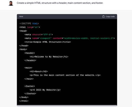
Create a simple HTML structure with a header, main content section, and footer.
This prompt returns a simple HTML skeleton. But if you want a more detailed structure, you could modify the prompt to include specific HTML elements. For example:
Create a simple HTML structure with a header containing a navigation bar, a main content section with a paragraph and an image, and a footer with copyright information.
Curious to know more? Visit our blog for the complete post and dive deeper into Learning Web Development with AI Prompts.
3 notes
·
View notes
Text
What is so astonishing to me about this is that ao3 is probably the easiest to navigate website I have ever used. I was used to ff.net hiding pages in pages, forcing you to create drafts within the website and then attach that draft to the story you're making after hitting "new story" and the drafts expire after long enough so little edits are ridiculously difficult and for some reason it couldn't comprehend basic html so it would delete all my italics and bolds and so I had to go looking for the tiny letters and slashes left behind and add it all back in manually after pasting from my word documents. I bookmarked every single relevant page to my bookmarks bar because I couldn't ever find the page I was actually looking for in my profile.
Compared to that?? Ao3 is STUPID easy, so I have trouble understanding how someone knows how to navigate Wattpad just fine but fails to comprehend ao3. Is it too easy and that's somehow suspicious? I swear browsers have had a built-in translation feature for a very long time, so even if you didn't know a single word in English, wouldn't your browser offer to translate it for you? If you're blind or visually impaired, then what about this pop up is more difficult to figure out than the entirety of Wattpad? Is there a generation of computer users who just black out on all pop ups by default because you expect them to be ads even if they're just a solid color with no links or websites listed in them?
I have many questions.

ohhh… you guys are like… STUPID stupid
38K notes
·
View notes
Text
youtube
How to Cutomize Home Page in Astra Theme 2025 ?
Customizing the home page in the Astra theme (2025 version) involves using a variety of tools that Astra offers, including the WordPress Customizer, Elementor (if you're using it), or the Block Editor. Here’s a step-by-step guide to help you customize the home page:
1. Access the WordPress Customizer:
Go to Dashboard > Appearance > Customize.
This will open the WordPress Customizer where you can make changes to your home page layout, colors, typography, and more.
2. Change the Homepage Settings:
Set a Static Front Page:
In the Customizer, go to Settings > Reading.
Under the “Your homepage displays” section, select A static page.
Choose a page you want to set as the homepage (either an existing page or create a new one).
Save the changes.
If You Want a Blog as Homepage:
In the same Reading section, select Your latest posts instead of a static page if you prefer the blog-style homepage.
3. Customize the Layout:
Go to the Astra Theme Customizer (or Astra Options if your version has it).
Navigate to Layout > Header to modify the header (logo, menu, etc.).
You can also modify the Layout > Footer to adjust footer settings.
Astra gives you flexible options to change the layout for both header and footer, including width, margins, and content.
4. Edit the Content of the Home Page:
If you created a static page for the homepage, you can edit it by going to Pages > All Pages and then clicking Edit on your homepage.
If you're using Elementor or another page builder, you can edit your home page using the drag-and-drop interface. Astra integrates seamlessly with Elementor to create a more visually dynamic homepage.
Just click on Edit with Elementor when editing the page.
5. Customize Sections on the Homepage:
For a more advanced customization, you can edit and add content sections like:
Hero section (big intro section at the top of your homepage)
Call-to-action buttons
Image galleries or sliders
Testimonials
These sections are typically added either through the block editor or Elementor widgets.
For example, in Elementor:
You can add sections by clicking the + sign and choosing from a range of premade templates or designing your own.
6. Typography, Colors & Buttons:
In the WordPress Customizer, go to the Typography and Colors sections to modify your site's text, heading fonts, button styles, link colors, and more. This allows you to match your brand’s color scheme and typography style.
Astra also offers settings like Global Colors and Typography that affect the entire website.
7. Widgets and Sidebars:
If you want widgets (such as recent posts, social icons, or search bars), go to Appearance > Widgets.
You can add widgets to any sidebar or widgetized area that appears on your homepage.
8. Use Astra Hooks (For Developers):
If you want to place custom code or content in specific areas, Astra provides hooks that allow you to add content at strategic points of the page (e.g., before or after the header, or before the footer).
You can use Astra's hooks with custom HTML, shortcodes, or widgets.
9. Preview and Publish:
After making all the changes, you can preview them in real-time.
Once satisfied, click Publish to save your customizations.
10. Advanced Customization (Custom Code):
If you want to further customize your homepage (CSS, HTML, or JavaScript), you can use:
Customizer > Additional CSS to add custom styles.
Theme Editor (under Appearance > Theme Editor) to directly modify theme files (note: only do this if you're comfortable with coding).
0 notes
Text
The Evolution of Web Design in Qatar: From Dial-Up to AI-Powered Experiences
Let’s rewind to the early 2000s in Qatar. Picture this: You’re sitting at a bulky desktop computer, waiting minutes for a single webpage to load. The screen flickers to reveal a plain text-heavy site with tiny images and a menu bar that looks like it was designed in Microsoft Word. Fast-forward to today, and you’re scrolling through a Qatari e-commerce site on your phone — sleek animations, Arabic calligraphy woven into modern layouts, and instant checkout options. How did we get here? Let’s dive into Qatar’s web design journey, explore what’s trending now, and peek into its futuristic ambitions.
The 2000s: Baby Steps in Qatar’s Digital Playground
When Qatar first dipped its toes into the internet, websites were like digital pamphlets. They weren’t pretty, but they got the job done. Government portals, local businesses, and even schools started creating basic HTML pages. Here’s what stood out:
Text Over Flash: Fancy graphics? Forget it. Early sites prioritized information — think paragraphs of text, bullet points, and maybe a pixelated logo.
Bilingual Basics: Even back then, Qatari sites knew their audience. Arabic and English text sat side by side, often in clunky layouts.
Patience Required: With dial-up internet, waiting for a site to load felt like watching sand trickle in an hourglass. Designers avoided heavy images to keep things moving.
Remember Qatar Airways’ first website? It was all flight schedules and contact details — no flashy promotions or 360-degree cabin tours. But these humble beginnings laid the groundwork for something bigger.
2024: Where Tradition Meets Cutting-Edge Tech
Today, Qatar’s web design scene is a vibrant mix of cultural pride and tech wizardry. Let’s break down what’s hot right now:
1. “Mobile-First” Isn’t a Trend — It’s a Rule
Over 90% of Qataris browse the web on smartphones. Sites now start with mobile designs, ensuring buttons are thumb-friendly and menus collapse neatly. Take Talabat’s app-like website: it’s so smooth you’ll forget you’re not using an actual app.
2. Arabic Calligraphy Gets a Modern Makeover
Gone are the days of generic fonts. Designers are blending traditional Arabic scripts with minimalist layouts. Check out Msheireb Properties’ site — elegant Kufic-style typography dances alongside crisp images of Doha’s skyline.
3. Speed is King (Thanks, 5G!)
Qatar’s 5G networks are among the fastest globally. Websites now load in under two seconds, with designers optimizing every image and line of code. Slow sites? They’re as outdated as flip phones.
4. Storytelling Through Scrolling
Qatar’s tourism sites are masters of this. Scroll down Visit Qatar’s homepage, and you’ll glide from desert dunes to futuristic skyscrapers, with videos that make you feel the Arabian Gulf breeze.
5. E-Commerce: No More “Add to Cart” Frustration
Local platforms like Snoonu and Farfetch Qatar have upped their game. Features like:
One-tap checkout
Live chat with real agents (no bots!)
AR try-ons for abayas and sunglasses
…are making online shopping feel like a VIP experience.
6. Inclusivity Takes Center Stage
Qatar’s push for accessibility is reshaping the web. Sites now include:
Voice navigation for visually impaired users
Color contrast adjustments for dyslexia-friendly reading
Easy-to-read fonts in both Arabic and English
2030 and Beyond: Qatar’s Web Design Crystal Ball
Qatar doesn’t follow trends — it creates them. Here’s what’s coming next:
1. “Siri, Find Me a Luxury Villa in Lusail”
Voice search is exploding. Soon, Qatari sites will answer queries like, “Show me hotels near Katara Cultural Village with sea views” in flawless Arabic or English.
2. Your Website Knows You Better Than Your Best Friend
AI will personalize sites in real time. Example: A returning visitor to Qatar National Bank’s site sees custom mortgage offers based on their browsing history — no login required.
3. Virtual Souq Waqif Tours
Why just read about a store when you can VR-walk through it? Future e-commerce sites might let you haggle with a virtual shopkeeper or smell digital oud perfume samples.
4. Eco-Friendly Coding
As Qatar aims for sustainability, expect “green web design.” Think solar-powered hosting servers and sites that track your carbon footprint while browsing.
5. Biometric Logins
Forget passwords. Qatari banking and government sites might soon use facial recognition or fingerprint scans for instant access.
Why This Matters for YOU
Whether you’re a startup in Education City or a heritage brand in Souq Waqif, your website is your digital handshake. In Qatar’s competitive market, a stale design can cost you customers. But a site that blends Qatari culture with innovation? That’s how you stand out.
Final Thoughts
From the dial-up days of the 2000s to tomorrow’s AI-driven interfaces, Qatar’s web design evolution mirrors its leap from regional player to global innovator. The next time you browse a Qatari site, notice the details — the way Arabic script flows like poetry, the split-second load times, the subtle nods to desert landscapes in the color palette.
For businesses, this isn’t just about keeping up. It’s about leading. And for users? It means smoother, smarter, and more beautiful online journeys.
0 notes
Text
How to Make a Movie Website: A Step-by-Step Guide
In today’s digital world, a movie website is essential for filmmakers, critics, and movie enthusiasts. Whether you are creating a site to showcase your own films, provide movie reviews, or list upcoming releases, having a professional website can enhance visibility and credibility. This guide will walk you through everything you need to know about how to make movie website that is engaging, functional, and optimized for search engines.
1. Define Your Website’s Purpose
Before diving into website development, define the primary goal of your movie website. Some common purposes include:
Movie streaming website – Showcasing your own or licensed films.
Film blog and reviews – Writing and sharing movie critiques and ratings.
Portfolio for filmmakers – Showcasing your projects and industry experience.
Movie news and updates – Providing the latest updates about upcoming films, trailers, and industry news.
Knowing your focus will help you choose the right design, features, and content strategy.
2. Choose the Right Domain Name
Your domain name is your website’s identity. Choose something relevant, memorable, and easy to spell. Consider the following tips:
Keep it short and simple (e.g., Movieworld.com, CineSpotlight.com).
Use keywords related to your niche (e.g., MovieReviewsHub.com).
Choose a .com domain for credibility.
Avoid numbers and hyphens, as they can confuse users.
3. Select a Reliable Web Hosting Provider
A fast and reliable web hosting service is crucial for website performance. Some popular hosting providers for movie websites include:
Bluehost – Affordable and beginner-friendly.
SiteGround – Excellent speed and customer support.
Hostinger – Budget-friendly and feature-packed.
Cloudways – Best for high-performance hosting.
Ensure the hosting provider supports high-bandwidth streaming if you plan to host video content.
4. Pick the Right Website Platform
The right CMS (Content Management System) or website builder makes development easier. Some great options include:
WordPress – Highly customizable with themes and plugins.
Wix – Drag-and-drop builder for easy design.
Squarespace – Elegant templates and built-in hosting.
Custom Development – Using HTML, CSS, and JavaScript for complete control.
For a movie website, WordPress is often the best choice due to its flexibility and SEO capabilities.
5. Design Your Website for a Cinematic Experience
Your website’s design should reflect the film industry’s aesthetic appeal. Follow these tips:
Use dark mode or a sleek, modern theme for a cinematic feel.
Incorporate high-quality visuals and trailers.
Add a carousel slider to showcase featured movies or reviews.
Use easy navigation with categories like “Latest Releases,” “Reviews,” and “Upcoming Films.”
Ensure a mobile-friendly design since most users browse on their phones.
6. Essential Features for a Movie Website
To make your movie website functional and engaging, include these key features:
Search bar – Helps users find specific movies or articles.
Video embedding – Showcase trailers and clips.
Comment section – Allow user interaction and discussions.
Social media integration – Boost engagement by sharing content.
Newsletter signup – Keep visitors updated on new content.
SEO-optimized blog – Improves website ranking and engagement.
7. Add Movie Content and Reviews
Content is king! Whether you’re showcasing your own films or reviewing others, make sure your content is original, engaging, and SEO-friendly.
Write detailed movie reviews with summaries, critiques, and star ratings.
Use bold keywords to improve search rankings.
Create engaging listicles like “Top 10 Must-Watch Movies.”
Update frequently with fresh content to keep users coming back.
8. Optimize Your Website for SEO
To rank higher on search engines, follow these SEO best practices:
Use targeted keywords in titles, meta descriptions, and content.
Optimize image alt text for better visibility.
Improve website speed using caching plugins.
Build backlinks from reputable film blogs and websites.
Regularly update content to stay relevant.
9. Monetize Your Movie Website
If you want to earn from your movie website, consider these monetization options:
Google AdSense – Display ads and earn from impressions/clicks.
Affiliate marketing – Promote movie merchandise, DVDs, or streaming platforms.
Premium memberships – Offer exclusive content for paying users.
Sponsored content – Collaborate with film studios for promotions.
10. Promote Your Website and Grow Your Audience
Building a website is just the first step; marketing it effectively is essential.
Share content on social media platforms like Instagram, Facebook, and Twitter.
Engage with the film community through forums and discussions.
Use email marketing to notify subscribers about new content.
Consider YouTube and TikTok for visual content promotion.
Leverage influencer marketing by collaborating with film bloggers.
Conclusion
Creating a successful movie website requires careful planning, the right tools, and continuous updates. Whether you’re a film reviewer, a filmmaker, or simply a movie enthusiast, a well-optimized website can boost your online presence and engage your audience effectively. Start today by choosing a platform, designing your site, and publishing high-quality content to attract movie lovers from around the world!
0 notes
Text
What’s the Difference Between Front-End and Back-End Development?

Web development is all about building websites and applications, and it’s divided into two main parts: front-end and back-end development. These two work together to make websites look good and function properly, but they have different tasks, tools, and skills. Let’s explore the differences in a simple way.
What is Front-End Development?
Front-end development is everything on a website or app that you can see and click on, like buttons, images, text, and menus. It’s all about making the website look nice and easy to use, so users can easily navigate and interact with it.
Example: When you visit a website and click on a button, the design you see and the way the button works is the result of front-end development.
Key Responsibilities of a Front-End Developer
Designing the user interface (UI): Creating how the website looks and making sure it's easy to use.
Making designs work on all devices: Ensuring the website looks good on phones, tablets, and computers.
Adding interactivity: Making the website interactive with things like buttons, menus, and animations.
Languages and Frameworks
Core Languages
HTML: Builds the structure of a website.
CSS: Styles the website with colors, fonts, and layout.
JavaScript: Adds interactivity like dropdowns and sliders.
Frameworks and Libraries
React.js: Used for building dynamic websites.
Angular: A powerful tool for building complex apps.
Vue.js: A simple and flexible tool for modern websites.
Bootstrap: Helps design websites that work well on all devices.
What is Back-End Development?
Back-end development is everything that happens behind the scenes on a website. It makes sure the website works properly by managing things like data storage and the server. When you do something on a website, like clicking a button or submitting a form, the back-end makes sure the right information is processed and sent where it needs to go.
Example: When you log into a website, the back-end makes sure your username and password are correct, finds your information in a storage system, and lets you into your account.
Key Responsibilities of a Back-End Developer
Managing Data: A back-end developer makes sure that data is stored safely and can be retrieved when needed.
Writing Code for the Server: They write the instructions that tell the website how to process actions, like when a user submits a form.
Making the Website Fast and Safe: They ensure the website works quickly and securely, protecting it from potential problems.
Languages and Frameworks
Core Languages
Python: Easy to learn and used with frameworks like Django and Flask.
Java: Great for large applications, often used with the Spring Boot framework.
PHP: Used for creating dynamic websites, with Laravel as a key framework.
Ruby: Often used with the Ruby on Rails framework for quick development.
JavaScript (Node.js): Allows developers to use JavaScript for both the front-end and back-end.
C#: Often used with ASP.NET for building web applications.
Databases
SQL-Based: Like MySQL, PostgreSQL, and Microsoft SQL Server for structured data.
NoSQL-Based: Like MongoDB, Cassandra, and DynamoDB for unstructured data.
The Connection Between Front-End and Back-End
Front-end and back-end work together to ensure the website functions correctly:
Front-End Role: When you visit an education website, the front-end shows you things like course listings, a search bar, and a login form to register or sign in.
Back-End Role: When you search for a course or log in, the back-end processes your request, checks the available courses in the database, and verifies your login details.
Front-End Role: After the back-end processes everything, the front-end shows you the list of courses or confirms your login and takes you to your student dashboard.
For example, when you want to enroll in a course, the front-end displays the course options. Once you select a course, the back-end checks if you're eligible, processes your enrollment, and confirms it. The front-end then shows your updated enrollment status.
Skills Required
Front-End Developer Skills
Proficiency in HTML, CSS, and JavaScript.
Knowledge of front-end frameworks like React, Angular, or Vue.js.
Experience with responsive and accessible design.
Basic understanding of back-end APIs for better integration.
Back-End Developer Skills
Knowledge of server-side programming languages like Python, Java, or PHP.
Familiarity with frameworks like Django, Flask, or Node.js.
Experience with databases (SQL and NoSQL).
Understanding of APIs, security practices, and server management.
Which One You Should Choose?
Choose Front-End Development if you enjoy creating visually appealing websites and focusing on how users interact with them. You’ll work on designs, layouts, and make sure everything looks good and functions smoothly for the user.
Opt for Back-End Development if you enjoy problem-solving, working with data, and focusing on how everything behind the scenes works. You’ll deal with servers, databases, and ensuring the website runs efficiently.
Consider Full-Stack Development if you're interested in both the front-end and back-end. You’ll get to work on all parts of a website, from what users see to how the data is managed and processed.
Average Salary for each Development Type
Front-End Developer
Focus on visual design and user experience, creating interactive and appealing websites.
₹6 LPA - ₹20 LPA (India)
$60,000 - $120,000 (Outside India)
2. Back-End Developer
Work on server-side logic, databases, and handling the functionality behind the scenes.
₹8 LPA - ₹25 LPA (India)
$70,000 - $130,000 (Outside India)
3. Full-Stack Developer
Work on both front-end and back-end, managing the entire website development process.
₹10 LPA - ₹30 LPA (India)
$80,000 - $150,000 (Outside India)
KEY TAKEAWAYS
Career Paths and Roles
1. Front-End Developers
Front-End Developer
Web Designer
Front-End Engineer
React Developer / Angular Developer
UI/UX Designer
2. Back-End Developers
Back-End Developer
Database Administrator (DBA)
Server-Side Developer
API Developer
DevOps Engineer
Front-end and back-end development are two parts of building a website—they depend on each other to create websites that work well and look good. Understanding the differences can help you choose which path is right for you.
Both areas offer great job opportunities and are important for creating the websites and apps we use every day.
#Difference between front end and back end#Front end vs back end#Responsibilities of front-end and back-end developers#Web development career paths#Languages and frameworks for front and back end
1 note
·
View note
Text
8 CSS & JavaScript Snippets for Creating Sticky Elements — Speckyboy
New Post has been published on https://thedigitalinsider.com/8-css-javascript-snippets-for-creating-sticky-elements-speckyboy/
8 CSS & JavaScript Snippets for Creating Sticky Elements — Speckyboy
Modern websites often feature extensive scrolling. Long pages are common on desktop devices, but are even more frequent on mobile screens. The practice creates usability challenges for tasks like navigation and referencing important information.
That’s where “sticky” design elements come in handy. They allow users to scroll without losing access to your site’s menu. You can also use them to keep ads in view, attach social media sharing buttons to the viewport, or create fun special effects.
Implementing a sticky element can be simple, as CSS has a dedicated position property for this function. JavaScript can be used for building more robust features. As usual, there are several methods to achieve your goals.
We searched the CodePen archives to find interesting examples of sticky elements in use. Below, you’ll find various options that enhance the user experience. So, get stuck in your easy chair and be inspired by these code snippets!
Pure CSS Header Animation to Sticky Navigation
Created by Amit
Sticky headers are among the most popular use cases. On Chromium browsers, this snippet uses CSS to transform a tall and narrow header into a full-screen bar upon scrolling. Unsupported browsers receive a narrower, taller, sticky header. Keyframe animation is used to create smooth transitions. The feature is useful, lightweight, and attractive.
See the Pen Pure CSS header animation to sticky nav by Amit
Sticky Responsive Sidebar Navigation
Created by Areal Alien
Sidebar navigation can also take advantage of staying put during scrolling. Hovering over the sidebar expands the navigation to include text labels – it works on mobile too. However, you might also reserve this concept for large screens and use the traditional “hamburger” menu for mobile.
See the Pen Sticky responsive sidenav by Areal Alien
CSS Sticky Table Header & Column
Created by Mike Golus
Long HTML tables can be a pain to read. You have to memorize the column headers to understand the context. Sticky headers make even the busiest tables easier to read. Using position:sticky (and a few other tricks) on the first row and column enables scrolling without losing sight of key information. The examples in this Pen demonstrate how it’s done.
See the Pen CSS Sticky Table Header and Column by Mike Golus
Long Scroll Sticky Sections
Created by Burmese Potato
Here’s a unique way to denote the various sections of a long page. Scroll down the page, and the episode number (displayed in the left column) sticks until you reach the end of the section. The snippet combines sticky positioning with the calc() property on the container’s height to keep the number in view. This little bit of CSS adds a nice touch to the user experience.
See the Pen Pretty Sticky by Burmese Potato
Just Another Sticky Section Layout
Created by Misala
Sticky design elements can also be used to show off product features. Scroll down this page and watch as featured text and videos change. The layout occupies the entire screen viewport and is responsive for mobile devices. It’s a high-end feature sure to capture a user’s attention.
See the Pen just another sticky section layout by misala
Multi-Navigation Sticky Bars & Layout
Created by Den
This snippet asks the question: What if you have more than one navigation bar? The first bar is sticky by default. Scroll past a few sections, and a second sub-navigation bar lines up underneath. That second bar also features a neat frosted glass look as content scrolls underneath.
See the Pen Sticky layout + filters #2024 by Den
Sticky Video with CSS @container scroll-state()
Created by Jhey
We’re seeing more websites implement sticky videos, where the presentation sticks to the bottom corner upon scrolling. It allows users to view the rest of your content without losing sight of the video. Here, CSS container queries are used to reposition the video player. Use the included config panel to see how different settings impact the animation effects.
See the Pen CSS @container scroll-state() faux PiP video by Jhey
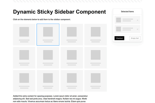
Dynamic Sticky Sidebar Component
Created by Ryan Mulligan
Features like shopping carts are a perfect fit for sticky sidebars. The UI makes it easier for shoppers to keep track of their cart and, most importantly, finish their purchase. This sidebar widget keeps track of cart contents and sticks to the screen while you scroll in the page content area.
See the Pen Dynamic Sticky Sidebar Component by Ryan Mulligan
Stick With What Works in Your Designs
We may think of sticky elements as being used for site headers and navigation. However, the examples above show that they can do much more. There are so many creative possibilities for informing and entertaining users.
What’s more, CSS can do a lot of the heavy lifting for you. Several snippets in this collection don’t require a single line of JavaScript. Still, it’s nice to know you can add some DOM manipulation when needed.
We hope this collection sparked your imagination! Check out our CodePen collection for even more sticky snippets.
Related Topics
Written by Eric Karkovack
Eric Karkovack is a web designer and WordPress expert with over two decades of experience. You can visit his business site here. He recently started a writing service for WordPress products: WP Product Writeup. He also has an opinion on just about every subject. You can follow his rants on Bluesky @karks.com.
Read more articles by Eric Karkovack
#2024#ADD#alien#amp#animation#Articles#attention#Building#Business#buttons#Capture#change#chromium#code#container#content#CSS#CSS Layout Snippets#CSS Snippets#Design#desktop#devices#easy#effects#Featured#Features#Filters#Full#glass#hamburger
0 notes
Text
Cydia iOS 18.2.1
Are you ready to explore the full potential of your iPhone? With the latest Cydia iOS 18.2.1, you can unlock exciting customization options, try amazing tweaks, and install unique themes. This article will guide you through everything you need to know about downloading Cydia iOS 18.2.1 and making the most of its features.
What is Cydia?
Cydia is the ultimate third-party app store for iOS users, offering apps and tweaks unavailable on the Apple App Store. Created for jailbroken devices, Cydia opens up a world of opportunities to personalize your iPhone in previously impossible ways. With Cydia, you can install tweaks, themes, IPA files, and more, giving you complete control over your device.
Why Choose Cydia iOS 18.2.1?
The latest Cydia iOS 18.2.1 version is designed specifically for iPhones running iOS 18.2.1. It provides:
Advanced Tweaks: Enhance your iPhone’s functionality with powerful tweaks that boost productivity and entertainment.
Customization: Install unique themes and transform your iPhone’s look.
Access to IPA Files: Download and run apps unavailable in the App Store.
Improved Performance: Enjoy smoother operations with the latest Cydia enhancements.
How to Download Cydia iOS 18.2.1?
You can download Cydia for iOS 18.2.1 easily from the official website. Visit https://www.cydiafree.com/cydia-download-ios-18-1-2-3-4-5-6-7.html and follow the instructions provided. The process is simple, and you’ll have access to Cydia quickly.
Exciting Features of Cydia iOS 18.2.1
Tweaks to Enhance Your Device
Tweaks are small apps or modifications that significantly improve your iPhone’s usability. Here are some popular tweaks you can try:
Battery Enhancers: Get more control over battery usage.
System Boosters: Speed up your device and reduce lag.
Custom Gestures: Add new touch gestures for better navigation.
Themes to Personalize Your iPhone
With Cydia, you can choose from hundreds of themes to customize your iPhone’s appearance. Whether you prefer minimalistic designs or vibrant visuals, there’s something for everyone.
Install IPA Files
Cydia allows you to sideload IPA files, which are applications that aren’t available on the App Store. From advanced tools to niche apps, the possibilities are endless.
Enhanced Security Options
Cydia iOS 18.2.1 also offers advanced security tweaks, enabling you to protect your data and privacy better.
How to Use Cydia Tweaks
Using Cydia tweaks is straightforward. Once you’ve installed Cydia, follow these steps:
Open the Cydia app on your iPhone.
Navigate to the "Search" bar and type the tweak name you want.
Select the tweak, read its description, and tap "Install."
Restart your device if prompted.
Your new tweak will be ready to use!
Is Jailbreaking Necessary for Cydia?
Yes, jailbreaking your iPhone is required to install Cydia. Jailbreaking removes Apple’s software restrictions, giving you root access to your device. While jailbreaking may void your warranty, it’s a reversible process. Ensure you use trusted jailbreaking tools for a safe experience.
Common Questions About Cydia iOS 18.2.1
Is Cydia Safe to Use?
Yes, Cydia is safe when used responsibly. Always download tweaks and apps from trusted repositories to avoid malware.
Will Cydia Slow Down My iPhone?
Properly installed tweaks won’t affect your device’s performance. Avoid installing too many tweaks to maintain optimal speed.
Can I Revert to Stock iOS?
You can restore your iPhone to its original iOS version using iTunes. This will remove all jailbreak modifications, including Cydia.
The Benefits of Customization
Customizing your iPhone through Cydia offers numerous benefits:
Unique Look: Stand out with themes and layouts that reflect your style.
Improved Productivity: Use tweaks to add shortcuts, automate tasks, and boost efficiency.
More App Options: Access apps unavailable in the App Store, giving you greater flexibility.
Stay Updated With Cydia
To make the most out of Cydia, keep your repositories updated. This ensures that you have access to the latest tweaks and apps. Regular updates also fix bugs and improve compatibility with your device.
Final Thoughts
Cydia iOS 18.2.1 is a must-have for anyone looking to enhance their iPhone experience. From exciting tweaks to stunning themes, Cydia offers endless possibilities for personalization and functionality. Ready to get started?
0 notes
Text
10 Essential Skills Every Web Designer Should Master

In 2025, Proper skills make a huge Difference between a good designer & great designer in the fastest digital world of web design. Mastery of the most essential skills make it possible for a website not only to look fantastic but also function well & be more user friendly.
In this Blog,We mentioned some skills that every web designer must have in 2025 . This can help on their career path .These skills not only enhance your ability to create visually stunning websites but also improve functionality, usability, and the overall user experience. Let's break it down into 5 essential skills Every web designer Should have.
1. User Experience (UX) Design
Effective web design depends on the Understand of User experience (UX). UX Designer is all about creating a website through all elements that are easy to navigate , more enjoyable. A good UX design ensures visitors can find what they need quickly without frustration.
Practical example :
When you visit Amazon, you can quickly find what you’re looking for thanks to the clear categories, filters, and search bar. For example, if you type “headphones,” you immediately see a list of products, reviews, and prices. This makes shopping easy and enjoyable.
How to Master UX Design:
Familiarize yourself with tools like Adobe XD and Figma.
Study user behavior and apply data-driven insights.
Continuously gather feedback and refine your designs.
2. Responsive Design
When it comes to Web Design, Responsive design is non negotiable. Websites only look good that is not essential but also all the layouts,elements must smoothly run across various devices in all sizes like from desktops,laptops, tab & mobile phones .
Why It Matters:
Responsive design helps to improve your Functionality, more mobile friendly for boost SEO Ranking.
How to Master Responsive Design:
Test your designs on various devices and browsers.
Use frameworks like Bootstrap or CSS media queries to create fluid layouts.
Practical example :
Open Facebook on your phone and then on a computer. You’ll notice how the layout adjusts to fit the screen size. On your phone, the menu is compact, and posts are arranged vertically for easy scrolling. This ensures it works smoothly no matter what device you’re using.
3. Visual Hierarchy
Visual Hierarchy is a key principle in design that helps to organize & prioritize content on web pages to guide the viewers. It ensures that the most important elements stand out while maintaining a clean & logical flow of Information.
Practical example :
Visit Apple’s website and see how they highlight their latest products. For example, the newest iPhone is shown in a large image with a bold headline like “iPhone 15 Pro.” Below it, you’ll find smaller details and links like “Learn More” or “Buy Now.” Your eyes are naturally guided from the most important information to the details.
How to Achieve Visual Hierarchy:
Use size, color, contrast, alignment, and spacing effectively.
Focus on making the website engaging and easy to navigate
4. Knowledge of Web Development Tools
A web designer will be more confident When the understanding the basic programming language & tools because it can help to collaborate with developers & together they both can design in a more practical way & achievable .
Tools and Skills to Explore:
Learn basic programming languages like HTML, CSS, and JavaScript.
Familiarize yourself with tools such as WordPress, Webflow, and code editors.
Practical Example :
On WordPress.com, you can design a basic website using its pre-made themes. However, knowing a little HTML or CSS allows you to customize the design further, like changing the colors or layout to match a brand’s style.
5. Communication Skills
Web design is not technical expertise, It is also about understanding your audience & engaging them through your message effectively. Strong communication skills help you collaborate with clients, developers, and other stakeholders.
What to do :
Invest time to improve your listening skills, & clear voice makes your communication strong with your clients But In the same way you understand human behaviour & human psychology helps you to convey your message in the website.
Practical Example :
Think of how Netflix promotes new shows. Their homepage uses big banners and clear text like “Watch Now” to tell you what’s popular. Similarly, web designers need to use simple language and design elements to help visitors understand what to do, like clicking a “Sign Up” button.
Conclusion
Mastering these five essential skills—UX design, responsive design, visual hierarchy, web development tools, and communication—can set you apart as a web designer. Start by focusing on one skill at a time, practice regularly, and stay updated with the latest trends in web design. Remember, great web design is not just about aesthetics but also about creating meaningful and seamless user experiences.
By honing these skills, you’ll not only improve your craft but also create designs that truly make an impact. Ready to level up your web design game? Start today, and watch your expertise soar!
0 notes
Text
Building a Website for Business Growth: Best Practices

In today’s digital-first world, your business growth strategy begins with your website. It’s more than just an online presence—it’s a powerful tool to attract, engage, and convert visitors into loyal customers. To achieve business growth through your website, you need a strategic approach that combines user-friendly design, compelling content, and SEO best practices. Here’s how you can build a website that fuels your business growth.
1. Start with a Clear Purpose
Your website should reflect your business goals. Are you selling products, offering services, or building an audience? Define your website’s primary objective and structure your pages to guide visitors toward taking specific actions, such as making a purchase, signing up for a newsletter, or contacting you.
Pro Tip: Use clear call-to-action (CTA) buttons like “Get Started,” “Learn More,” or “Contact Us” to guide your visitors effectively.
2. Prioritize Mobile-Friendly Design
With more than half of global website traffic coming from mobile devices, a mobile-friendly design is non-negotiable. Responsive websites adapt seamlessly to different screen sizes, ensuring a smooth experience for all users.
Why It Matters for SEO: Google prioritizes mobile-first indexing, which means your website’s mobile version impacts your search rankings.
3. Optimize for Speed
Visitors expect your website to load quickly. A slow-loading site frustrates users and increases bounce rates, directly affecting your SEO and conversions.
Best Practices for Speed Optimization:
Compress images without compromising quality.
Minimize CSS, JavaScript, and HTML.
Use a reliable hosting provider and a content delivery network (CDN).
4. Create SEO-Optimized Content
Quality content drives traffic and establishes your authority in your industry. Use keyword research to identify terms your audience is searching for and incorporate them naturally into your headlines, subheadings, and body text.
Content Tips for Growth:
Write blog posts that address common pain points or questions.
Use internal linking to guide users through your website.
Add meta titles and descriptions that include target keywords while remaining compelling.
5. Focus on User Experience (UX)
A website with great UX keeps visitors engaged and encourages them to explore further. Ensure your site is easy to navigate with intuitive menus, a clean layout, and accessible features.
Quick UX Wins:
Use a simple, consistent navigation bar.
Avoid clutter; focus on a clean, professional design.
Include a search bar for easy access to information.
6. Incorporate Social Proof
People trust what others recommend. Display testimonials, reviews, and case studies prominently on your website to build trust and credibility.
Where to Use Social Proof:
Highlight customer reviews on your homepage.
Share success stories on a dedicated “Testimonials” or “Case Studies” page.
7. Leverage Analytics and Tracking
To grow your business, you need to understand how your website is performing. Use tools like Google Analytics to track key metrics such as traffic, bounce rate, and conversion rate.
Key Takeaway: Regularly analyze data to identify trends and make informed improvements to your website.
Take Action Today!
Your website has the potential to be a powerful growth engine for your business, but it requires careful planning and execution. By combining these best practices with consistent monitoring and updates, you can create a website that not only attracts visitors but also converts them into loyal customers.
Start building your growth-focused website today, and watch your business thrive in the digital landscape!
1 note
·
View note
Text
Five Key Tips for eCommerce Optimization and How to Implement Them
Optimizing an eCommerce site can significantly enhance user experience, increase conversion rates, and boost sales. Here are five key tips for eCommerce optimization and how to implement them:
Improve Page Load Speed How:
Optimize Images: Compress images using tools like TinyPNG or JPEG Optimizer without compromising on quality.
Use a Content Delivery Network (CDN): CDNs store copies of your site’s static files closer to users, reducing latency.
Minimize HTTP Requests: Combine files (CSS, JavaScript) to reduce the number of requests.
Leverage Browser Caching: Enable caching so that users’ browsers can store parts of your site, which speeds up subsequent visits.
Enable Compression: Use Gzip or Brotli to compress your site’s files. Collaborating with an eCommerce Marketing Agency can help implement these optimizations effectively.
Enhance Mobile Experience How:
Responsive Design: Ensure your site is mobile-friendly and adjusts smoothly to different screen sizes.
Simplify Navigation: Use a clear, easy-to-navigate menu structure tailored for mobile users.
Optimize Touch Elements: Make sure buttons and links are easily tappable with enough space around them.
Accelerated Mobile Pages (AMP): Implement AMP to speed up page loading on mobile devices. Consulting an Amazon Marketing Agency can streamline the mobile optimization process.
Simplify the Checkout Process How:
Reduce Checkout Steps: Aim for a one-page checkout or minimize the number of steps required to complete a purchase.
Guest Checkout: Allow users to purchase without creating an account.
Auto-fill and Auto-complete: Use tools to fill in user information automatically based on previous data.
Clear Progress Indicators: Show users where they are in the checkout process and what steps remain. An eCommerce Marketing Agency can assist in designing user-friendly checkout processes.
Optimize Product Pages How:
High-Quality Images and Videos: Use high-resolution images and videos from multiple angles to showcase products.
Detailed Descriptions: Write comprehensive and engaging product descriptions with key features, benefits, and specifications.
Customer Reviews and Ratings: Display user reviews and ratings to build trust and provide social proof.
Call-to-Action (CTA): Use clear and compelling CTAs like “Add to Cart” or “Buy Now.” Partnering with an Amazon Marketing Agency can enhance product page effectiveness.
Utilize Data and Analytics How:
Google Analytics: Set up and regularly review Google Analytics to track user behavior, traffic sources, and conversion rates.
A/B Testing: Use tools like Optimizely or VWO to test different versions of your website to see which performs better.
Heatmaps and Session Recordings: Use tools like Hotjar or Crazy Egg to understand how users interact with your site.
Conversion Funnel Analysis: Identify where users drop off in the purchasing process and make improvements to those areas. An eCommerce Marketing Agency can analyze these data points to provide actionable insights.
Implementation Example: Improving Page Load Speed:
Optimize Images:
Use TinyPNG to compress product images.
Implement srcset in HTML to serve appropriate image sizes based on the user’s device.
CDN Setup:
Choose a CDN provider like Cloudflare or Amazon CloudFront.
Configure your website to serve static assets (images, CSS, JavaScript) through the CDN.
Enhancing Mobile Experience:
Responsive Design:
Use CSS media queries to create a responsive layout.
Test the site across various devices and browsers using tools like BrowserStack.
Simplify Navigation:
Implement a hamburger menu for mobile devices.
Ensure the search bar is easily accessible on mobile.
By focusing on these key areas and continuously monitoring and refining your strategies, you can significantly enhance the performance and user experience of your eCommerce site. Collaborating with an eCommerce Marketing Agency or an Amazon Marketing Agency ensures your optimization efforts align with industry best practices and yield maximum results.
For more visits: Teamsuccesso
0 notes
Text
Web Development on a Budget: Free Tools Every Beginner Should Know About
https://cogneiss.com/wp-content/webp-express/webp-images/uploads/2024/02/OurExperties.png.webp
Starting in web development can be an exciting journey, but it often comes with a daunting list of tools and software. For beginners, finding high-quality resources without spending much money is essential. Luckily, there are plenty of free tools out there to help you learn the ropes and create effective websites on a budget. Whether building a personal project or working with a web development company, these tools can be game-changers. Let’s explore 10 essential free tools that will make your life easier as you dive into the world of web development!
Visual Studio Code (VS Code) Why It's Great: VS Code is a powerful, free code editor that's widely used in the industry. With features like syntax highlighting, debugging, and an integrated terminal, it provides everything a beginner needs. How to Use It: Install VS Code and start experimenting with HTML, CSS, and JavaScript. You can customize it with plugins for a tailored experience.
GitHub Why It's Great: GitHub offers free repositories for beginners to store and manage their code. It’s also an excellent way to learn version control and collaborate with others. How to Use It: Use GitHub to save your projects and track changes over time. Many web development companies rely on GitHub for managing large-scale projects.
Bootstrap Why It’s Great: Bootstrap is a free, open-source CSS framework that simplifies responsive design. It’s perfect for beginners who want to create a mobile-friendly website without diving deep into CSS. How to Use It: Explore Bootstrap’s library of components like buttons, forms, and navigation bars. You can quickly build layouts that look great on any device.
Canva Why It's Great: Web design involves more than just coding. Canva is a free graphic design tool that helps beginners create visuals, from website banners to social media images. How to Use It: Use Canva’s templates to design professional-looking images. Many web development solutions include visuals as a key component, making this tool essential.
Google Chrome DevTools Why It's Great: Chrome DevTools is a set of developer tools built into the Chrome browser. It allows you to inspect and debug your website directly in the browser. How to Use It: Use DevTools to experiment with your code, fix layout issues, and test mobile responsiveness. It's invaluable for finding bugs and fine-tuning your site’s appearance.
WordPress Why It's Great: WordPress is the world's most popular Content Management System (CMS), and it’s free to use. It’s perfect for beginners interested in building a blog, portfolio, or small business website. How to Use It: Install WordPress and start exploring themes and plugins. Many web development companies recommend WordPress for clients looking for a simple and cost-effective website solution.
Unsplash Why It's Great: Unsplash offers free high-quality images that you can use on your website. Good visuals can elevate your design and make your site look professional. How to Use It: Browse the Unsplash library to find images that suit your project. Whether you're building a personal website or working with a web development company, images play a crucial role in capturing attention.
Figma Why It’s Great: Figma is a free design tool that allows you to create website prototypes and collaborate with others. It's perfect for web designers who want to visualize their layouts before coding. How to Use It: Use Figma to create wireframes and design concepts. You can even collaborate with others, which is ideal if you're part of a web development solution team.
Font Awesome Why It’s Great: Font Awesome provides a library of free icons that you can easily integrate into your website. Icons help communicate ideas visually and make your site more engaging. How to Use It: Choose from thousands of icons and include them in your projects to improve readability and style. Many web development solutions use Font Awesome to enhance user experience.
Lighthouse Why It’s Great: Lighthouse is an open-source tool by Google that helps you audit your website’s performance, accessibility, SEO, and more. It’s a powerful way to ensure that your site meets industry standards. How to Use It: Run a Lighthouse audit in Chrome DevTools to get a report on your website’s performance. Implementing the suggestions will improve your site’s user experience and ranking potential. Conclusion With these free tools, web development becomes accessible to everyone, no matter your budget. From powerful code editors and design tools to libraries that speed up the development process, there are countless ways to create high-quality websites without spending a dime. Even if you’re working with a web development company, these tools can serve as a strong foundation for collaboration and learning. As you build your skills, remember that these resources are just the beginning. Advanced tools and paid resources can add more capabilities as you grow. But for now, start with these essentials and watch your ideas come to life—no big budget required!
#web development service#web development tools#free web development tools#free web design tools#web design tools
1 note
·
View note
Text
The Essential Elements of Website Design: Crafting a User-Centric Experience

Website design is at the heart of digital branding, providing the foundation for how users perceive and interact with a business online. As digital competition intensifies, having a visually appealing, responsive, and functional website is crucial for making a strong first impression and driving conversions. This article explores the core components of effective website design and how they contribute to an impactful online presence.
User-Centric Approach: Designing with the User in Mind
A successful website prioritizes the user experience (UX) by anticipating users' needs and providing clear, intuitive navigation paths. Understanding the target audience’s preferences, behavior, and pain points is critical to guiding design decisions.
Simple Navigation: Users should find what they need quickly. Streamlined navigation bars, organized menus, and breadcrumb trails help users easily locate content, creating a more satisfying experience.
Responsive Design: With a significant portion of traffic coming from mobile devices, responsive design ensures websites display and function correctly on any screen size.
Accessibility: Inclusive design is essential. Features such as alternative text for images, clear contrast, and keyboard navigation make a site accessible to all users, including those with disabilities.
Visual Design: The Aesthetic Appeal
Visual appeal is the first thing users notice when they visit a website. A harmonious color scheme, thoughtfully selected fonts, and high-quality images contribute to a cohesive look that reflects the brand’s identity and personality.
Color Scheme: Colors evoke emotion and reinforce branding. A healthcare website might use calming blues and greens, while an e-commerce fashion site could choose vibrant hues to create excitement.
Typography: Fonts are more than just text; they set the tone. Selecting readable, consistent fonts enhances readability while maintaining a professional feel.
Images and Graphics: Visual elements should be purposeful, enhancing the message rather than distracting users. High-quality images, infographics, and icons keep users engaged while also enhancing the site’s professional look.
Functionality: Ensuring Smooth Performance
Functionality is crucial to keeping visitors on the site and guiding them through the user journey without disruptions. Even the best visuals and content won’t retain users if the site is slow, buggy, or difficult to use.
Loading Speed: Quick loading times are critical as users have limited patience. Optimizing images, reducing code, and using fast hosting options all contribute to faster page loads.
SEO-Friendly Structure: Proper HTML structuring, relevant keywords, and optimized images make it easier for search engines to index the site, boosting visibility and increasing organic traffic.
Cross-Browser Compatibility: A good website works well on all major browsers, including Chrome, Safari, and Firefox, ensuring every visitor has the same positive experience.
Content Quality: Informative and Engaging Content
Content is the voice of a website, guiding users to take specific actions, whether it’s learning more, making a purchase, or subscribing to a newsletter. High-quality content that resonates with the audience is as important as the design itself.
Clear and Persuasive Copy: Well-written, concise copy communicates key messages without overwhelming users. It’s essential to make each word count, providing value and guidance.
Effective Calls to Action (CTAs): CTAs drive user actions, so they should be clear, visually distinct, and placed strategically. Phrases like “Get Started,” “Learn More,” or “Contact Us” can be the subtle push users need.
Multimedia Integration: Videos, animations, and graphics add a layer of interactivity to a website. These elements should enhance the content and be optimized for fast loading to avoid slowdowns.
Conclusion
An effective website balances aesthetics, usability, and functionality, creating a smooth, engaging experience for users. By focusing on user-centric design, visual appeal, and reliable functionality, a well-designed website enhances brand perception, fosters trust, and encourages action. Staying adaptable to trends and technological innovations ensures that websites remain a powerful asset in the digital age, supporting business goals and delighting users in the process.
1 note
·
View note
Text
Bootstrap Online Training - NareshIT
Bootstrap Online Training - NareshIT
https://nareshit.com/courses/bootstrap-online-training
Description:
Thiscourse begins with an introduction to Bootstrap and its key features. Participants will learn how to use Bootstrap's grid system, components, and utilities to create responsive layouts and enhance the user experience.

Course Objectives:
The primary objectives of the Bootstrap course are as follows:
Introduction to Bootstrap: Provide an overview of Bootstrap, its history, and its role in front-end web development
Grid System: Explore Bootstrap's responsive grid system for creating flexible and adaptive layouts.
Components: Cover Bootstrap components, including navigation bars, modals, carousels, and other UI elements.
Typography and Utilities: Introduce Bootstrap's typography styles and utility classes for efficient styling.
Customization: Teach participants how to customize Bootstrap styles, colors, and components to match specific design requirements.
Responsive Design: Emphasize responsive design principles in Bootstrap for creating websites that work seamlessly across devices.
Integration with JavaScript: Explore the integration of Bootstrap with JavaScript components for enhanced interactivity.
SASS (Syntactically Awesome Stylesheets): Provide an introduction to SASS, a preprocessor scripting language for CSS, often used with Bootstrap.
Accessibility: Discuss best practices for ensuring accessibility in Bootstrap-based web applications.
Project Development: Engage participants in hands-on projects to apply Bootstrap concepts to real-world scenarios.
Prerequisites:
Basic understanding of HTML and CSS.
Familiarity with responsive web design principles.
Knowledge of JavaScript and its fundamentals.
Understanding of CSS preprocessors (e.g., Sass).
Awareness of front-end development frameworks.
Experience with using and navigating code editors or IDEs.
Who can learn this course:
Front-End Developers
Web Designers
UI/UX Designers
Full Stack Developers
Students and Beginners
Entrepreneurs and Small Business Owners
Anyone Curious about Bootstrap
Training Features:
Comprehensive Course Curriculum
Experienced Industry Professionals
24/7 Learning Access
Comprehensive Placement Programs
Hands-on Practice
Lab Facility with Expert Mentors
For Online Training:
India:
+91 8179191999
Whatsapp:
+91 8179191999
USA:
+1 4042329879
Email: [email protected]
0 notes